Pata
Pet Care Services
Simple and transparent mobile app to connect pet owners with high-quality pet services providers
Challenge
Pet owners often lead busy lives and may require assistance with caring for and walking their furry friends. They want their pets to receive the best possible care and attention while they're away.
Problem
Pet owners seek trustworthy individuals to care for their furry friends, and standard caretaking services may not always meet their expectations.
Solution
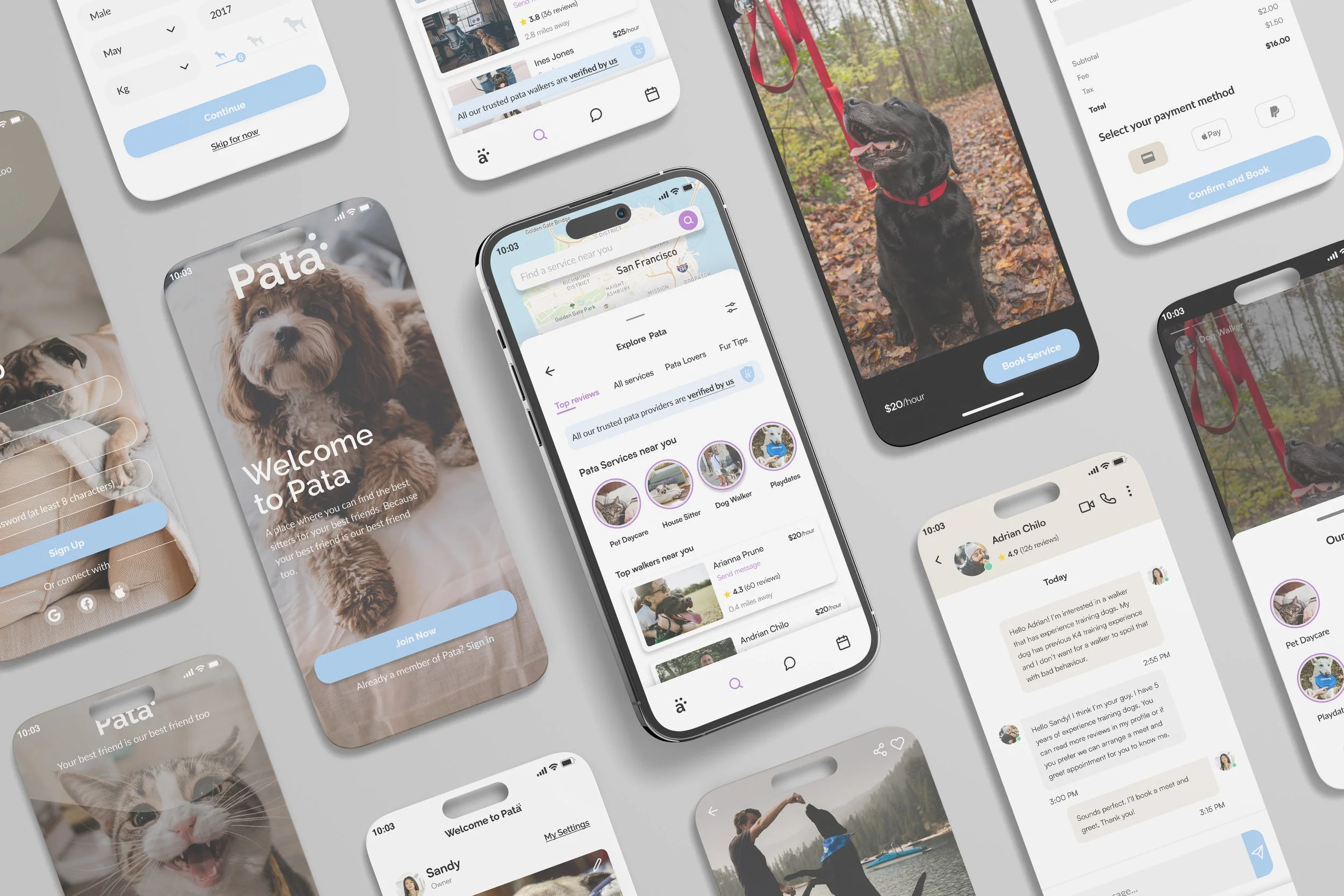
To meet this need, I developed a simple and transparent mobile app that connects pet owners with high-quality service providers, including dog walkers, pet sitters, and dog trainers. My aim is to help pet owners feel confident that their furry friends are in safe hands.
“Where goodbye isn’t as hard.”
I performed user research to identify the main pain points and goals of end-users. This involved conducting 1:1 interviews with over 10 users and analyzing the data using affinity diagramming. I then ideated solutions individually and as a group through brainstorming and Crazy 8's exercises.
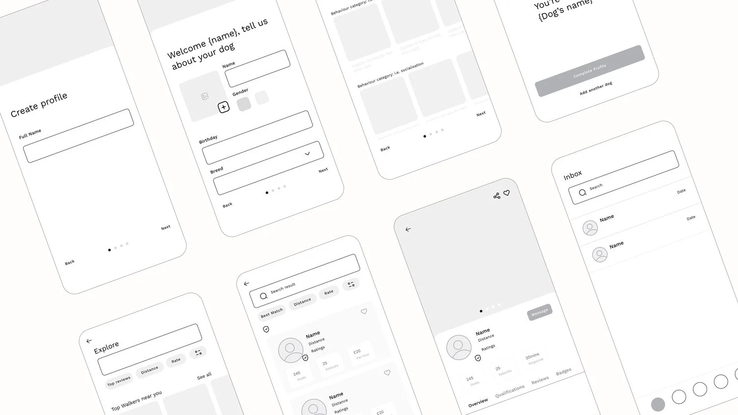
Using the insights gained from user research, I created a persona poster, user flows, and wireframes. I conducted design critique sessions with my Dribbble mentor and peers and developed a UI design, design system, and branding for the platform.
To test the design, I built prototypes with interactive features and tested them with over 10 users.
I was part of a small cohort in the Product Design Course sponsored by Dribbble, where we shared our work and provided weekly feedback to each other. I want to give a massive shoutout to my mentor, Juan Carlos Diez Rodriguez, for his patience and support throughout the course.
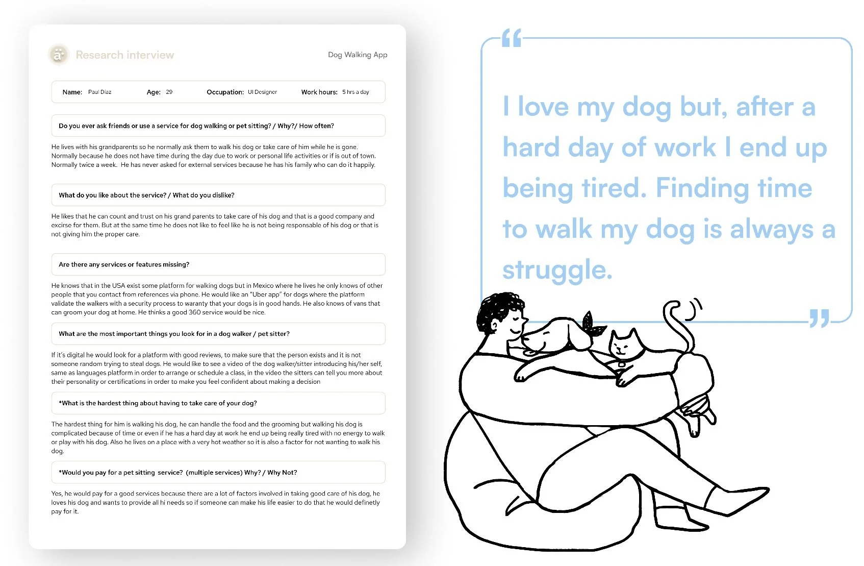
After defining the problem statement faced by potential users, I developed a user interview script to begin empathizing with my target audience. I conducted 1:1 interviews with 10 pet owners, lasting 20 minutes each, to discover their main pain points and goals.
Key highlights from my findings
90% of users trust their family and friends to watch their pets.
80% stated that trustworthiness was the most important quality they looked for in a pet care provider.
95% had never used a dog walking app or online pet sitting/care services before.
90% sought experience, kindness, and patience in a pet sitter with knowledge of their specific dog breed, temperament, and size.
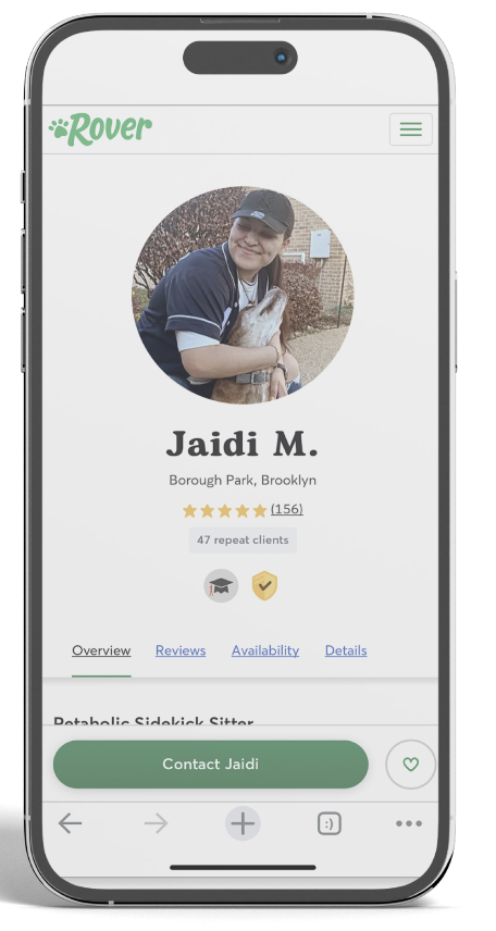
As part of my user research and discovery, I performed a competitive analysis of two significant competitors: Rover and Wag, to try to find if the user pain points were being solved by current industry leaders.
Key things that were compared:
Overall user experience as a first-time user.
Simplicity, transparency, and ease of ability to book a service.
Depth of detail in service provider profiles and verification.
As a result, I found the information provided overwhelming, a poor filtering system, and multiple frustration points across the platform, with a lot of steps required before being able to book a service. Overall, people want to see honest reviews, trusted verification, achievements, prior experience, and clarity of information to determine if the dog walker is trustworthy and competent for the job.
Based on my findings from user research, I came up with a persona poster that reflects the main user for the app. This persona helped me define the expectations, concerns, and motivations of my target users.
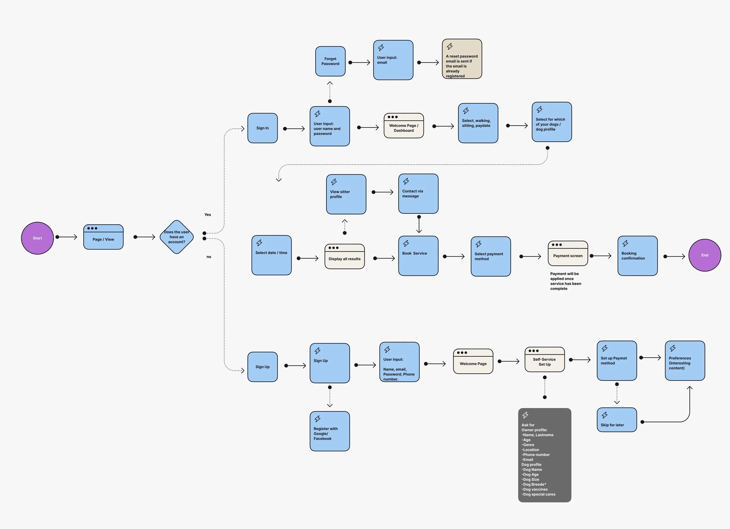
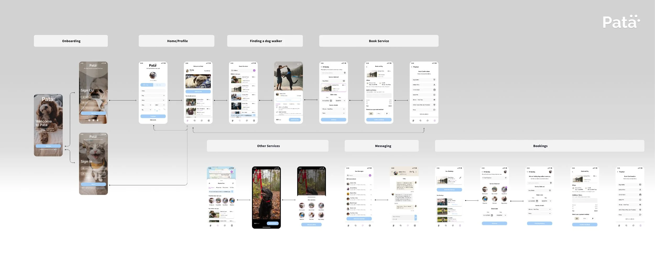
Before diving into designing screens, I begin by mapping out a happy path for the user flow inside the app. This approach allows me to identify how our users will move through the app and make a list of the screens that I need to design without spending too much time on edge cases.
An important key takeaway from this phase is that “The process is not linear”. This means I will iterate over my happy path multiple times until I find a streamlined process, and that is what happened with my wireframing.
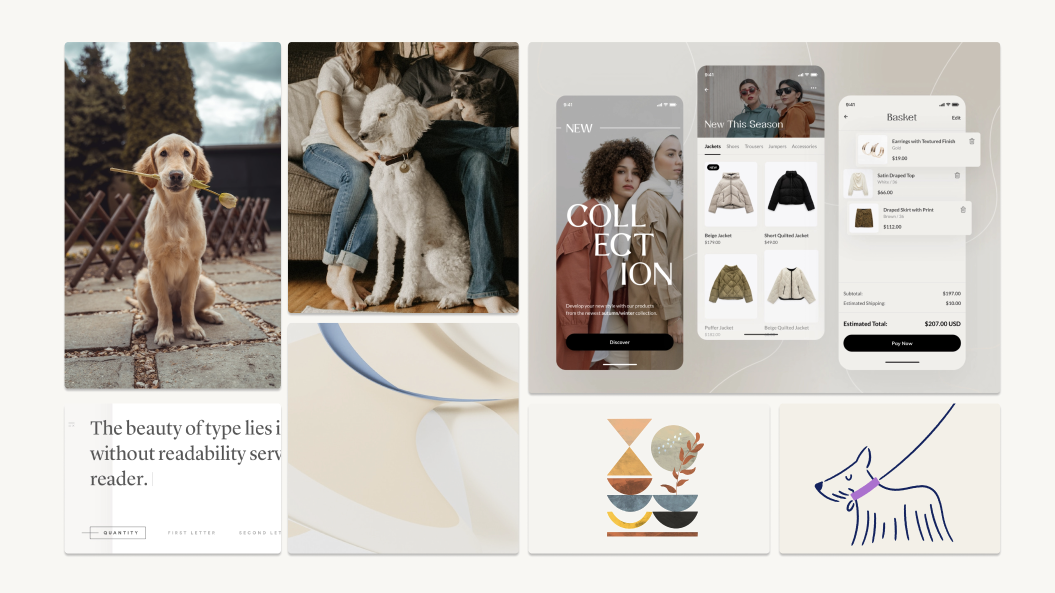
Following the discovery phase, I identified several key attributes of the brand: soft, calm, cozy, friendly, curated, and sophisticated. I created a mood board to inspire the typography, colors, and other visual elements that would portray a clean, professional, and friendly feel.
I want to evoke a sense of “home”
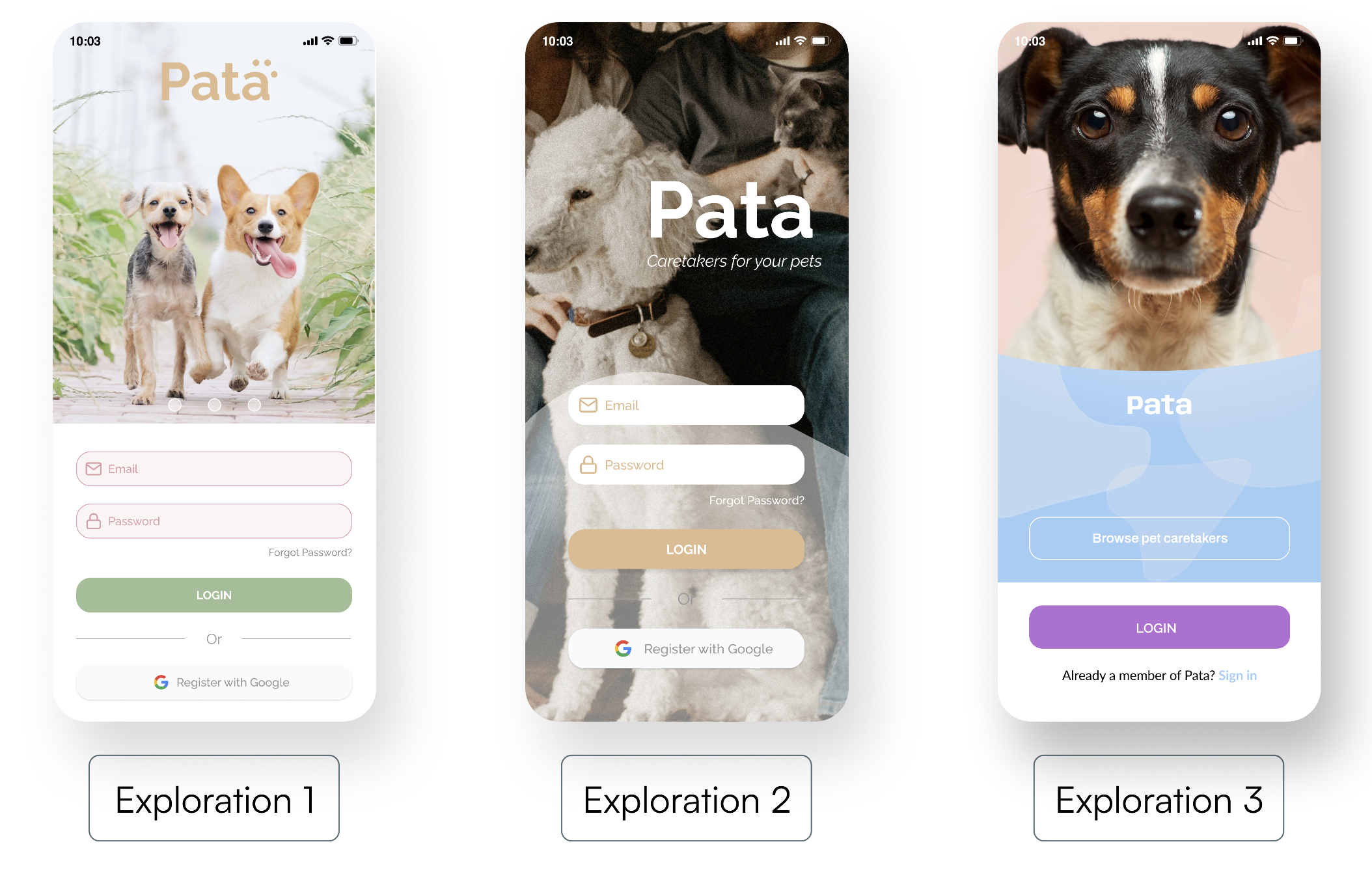
I spent some time designing explorations that reflected the inspiration from my previous mood board. The most important part of this phase was staying true to the core attributes of the brand while also fulfilling the purpose of the app.
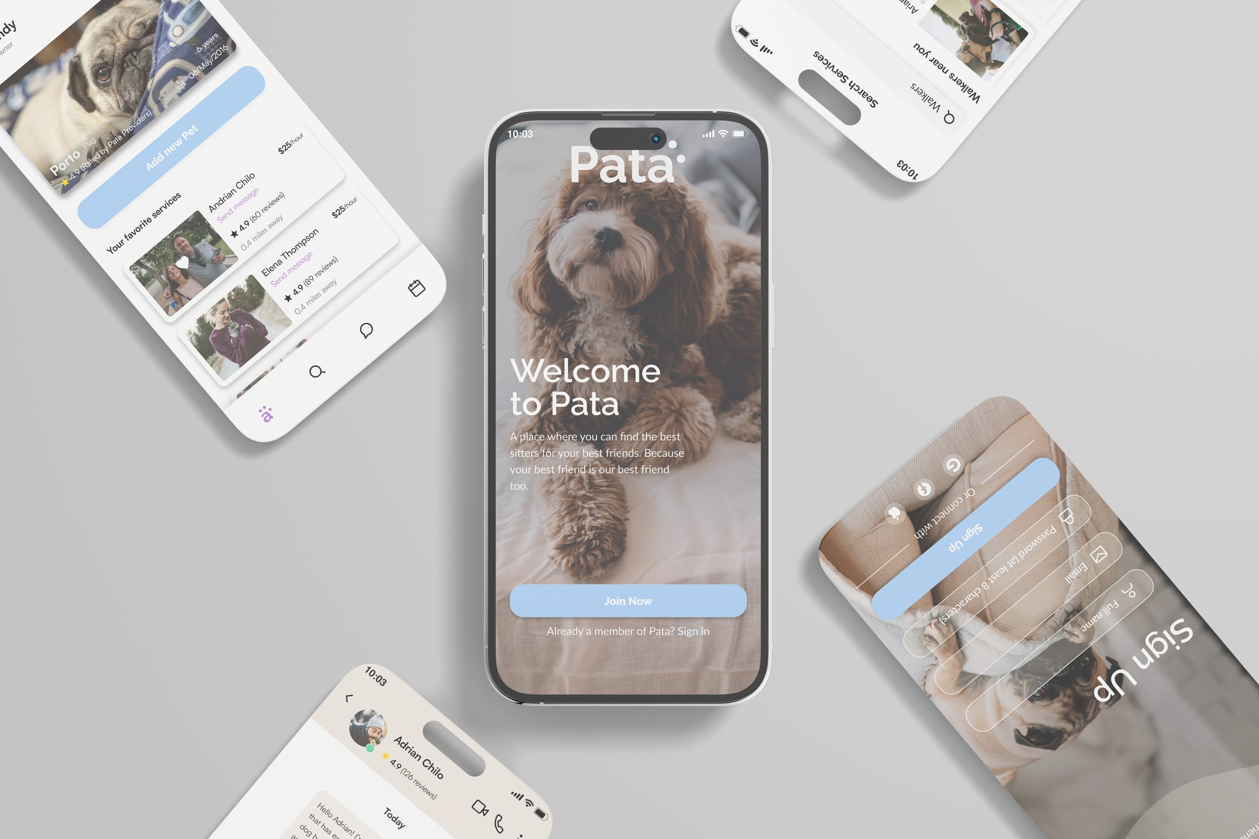
For the final visual design, I decided to merge multiple elements from all explorations. I tried to maintain the essence of exploration number 2 as my primary approach for its more sophisticated look and feel, rather than a playful one, in order to make my target users feel that Pata is a high-quality premium service.
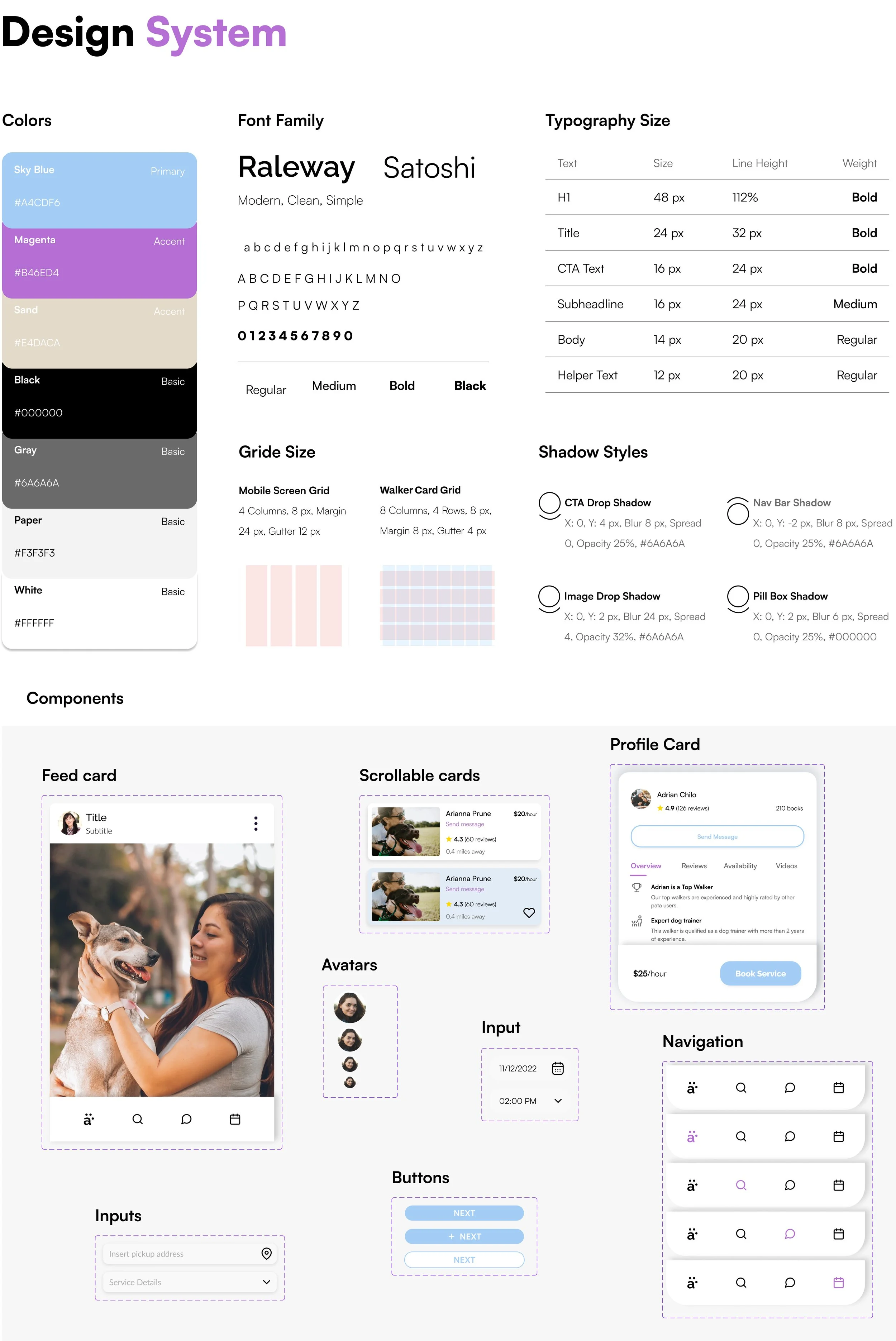
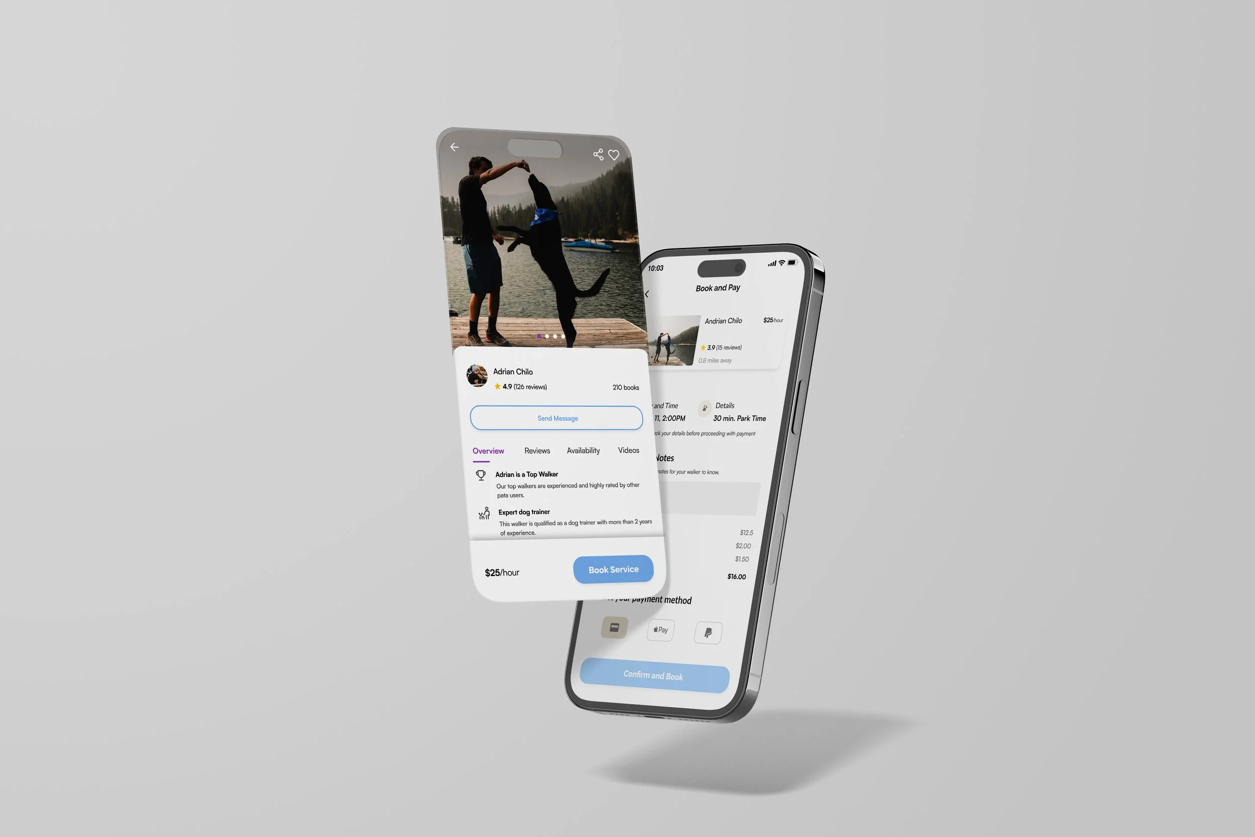
After a couple of design critique sessions. I decided it was time for me to design all screens in high fidelity. I worked on some branding to complement the visual design and a small design system I defined based on the merged exploration. I keep consistency not only by the use of typography, size, or color but also by taking care of balance, proximity, alignment, hierarchy, repetition, and contrast.
Testing an interactive prototype with target users allowed me to identify weak spots in my application and fix them. I was able to observe it the user flow I created was intuitive while users complete some tasks.
After the first round, I refined some minor design inconsistencies, tested again, and measured success. Overall, users were more inclined to trust the walkers on this platform and use their services. The ability to see photos and recent videos of services, the verified badge for walkers provided by Pata, and the easy and clean look and feel across the platform were the most likable features. Users felt that the proposed look and feel were professional and consistent, and they appreciated that the information was sufficient and easy to understand.

